The four key kitchen layouts
Follow this advice to achieve the ideal combination of function, ergonomics and workflow
Whether you’re starting from scratch with a self-build, adding an extension, or considering reworking a whole room or several, it is important you take the time get the kitchen layout right.
At the most basic level, a layout is determined by the size of the room and where you want each functional zone to be. As a general rule of thumb, U- and L-shaped designs tend to work best in smaller spaces, while galley and linear configurations are a good solution for really tight areas and open-plan apartments.
Designs that include an island unit require space to work effectively, making them well-suited to large or open-plan kitchens. And don’t forget to consider the working triangle.
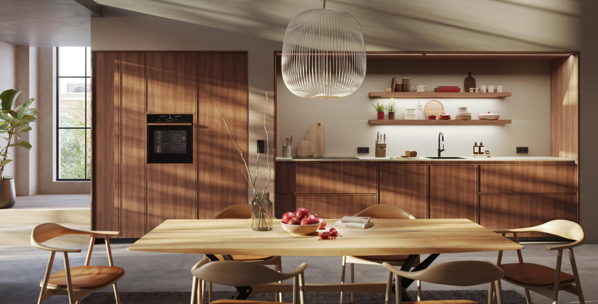
1. Galley – for small spaces
Consisting of units along one wall to form a single galley, or the wall facing to make a double galley, this layout is perfect for long, narrow kitchens and smaller rooms.
It’s an efficient use of space, with usually only a few steps between each element of the working triangle. Galley designs often suffer from a lack of storage, but too many wall cupboards can make the room feel cluttered. Instead, opt for tall units at the end of runs and try staggering the depths or heights of your cabinets to avoid the corridor effect.
Workspace may be limited with this layout, so investigate ways of maximising it – sink covers and flush-fitted induction hobs that can double as surfaces will help. While not always suitable for multiple cooks, a galley kitchen can usually be divided into zones.
There’s also a good amount of flexibility in the length of the kitchen, so it adapts well to suit different homes. For a sleek look when not they’re in use, consider concealing some of the kitchen units behind sliding doors.
‘When planning a galley space, consider where you’d like your appliances and sink – you may want to have your electrical items on one side and your wet zone on the other,’ advises Doug Haswell, furniture manager at Caple. ‘Remember to keep to the basics, such as base and wall cabinets, a fridge-freezer, sink, oven and dishwasher.’
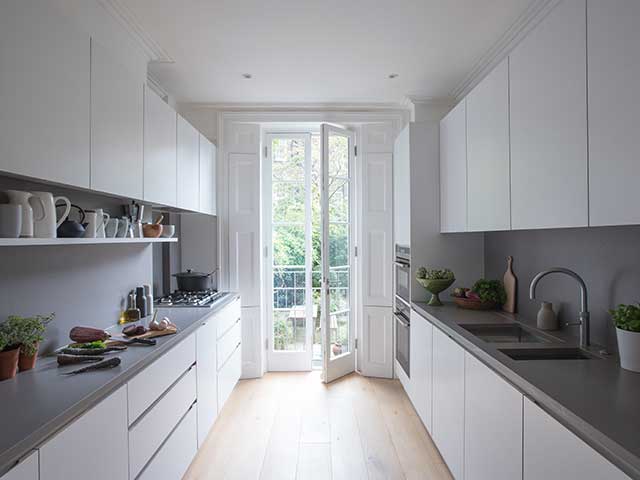
Avoid feeling enclosed in a galley kitchen by breaking up units with open shelves, appliances and glazed doors. Photo: Jack Trench
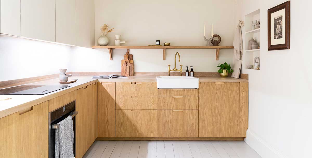
2. L-shaped – for flexibility
Ideal for small and medium-sized kitchens, this layout uses two runs of cabinetry that meet at a corner, creating workspace against two walls. However, an L can also be formed with a peninsula unit and one wall. Generally, the cooking and sink areas should be perpendicular to each other, creating a practical, elongated working triangle.
In a large space, the layout can easily be adapted for dining with a table, peninsula unit at one end or a kitchen island. These elements also help if you don’t always want to be cooking or chatting while facing a wall.
Supersized L-shaped kitchens can suffer from a lack of efficiency if the main elements of the triangle are too far away from each other, so be sure to keep the cooking, sink and cooling zones reasonably close together. Conversely, be sure to allow enough workspace between each zone.
On the plus side, L shapes allow flexibility in the length of the kitchen, such as creating a long run of worktop along one axis. They are also straightforward to zone, and you’re unlikely to have people getting in your way whilst you are busy cooking.
‘An L-shaped design works brilliantly within open-plan layouts,’ explains Louise Richardson, kitchen designer at Halcyon Interiors. ‘It’s especially good for the corner of a room where you don’t want the kitchen to be the main focal point.’
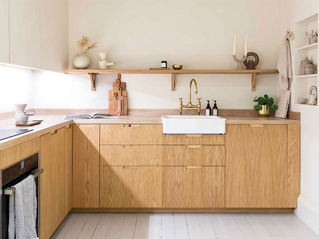
An L-shaped kitchen with cabinetry by Custom Fronts
3. U-shaped – for wide rooms
This type of layout maximises storage, with units covering up to three walls to create a balanced working triangle. This means you’ll benefit from lots of workspace and it’s easy to segregate into tasks.
However, it creates two corners, so to prevent dead space, think about dedicated internal storage, such as carousels, magic corners or Le Mans, which swing outwards.
If the room is big, consider adding a kitchen island as a midway point to help work flow. In a compact space, be aware that a U-shape can restrict the number of people cooking at the same time or where you position appliances with drop-down doors, such as dishwashers.
‘U-shaped kitchens put you at the centre of the action, with a lovely wraparound feel,’ says Graeme Smith, senior designer at 1909 Kitchens. ‘They create a divide between areas, while still keep them visually and socially connected.’
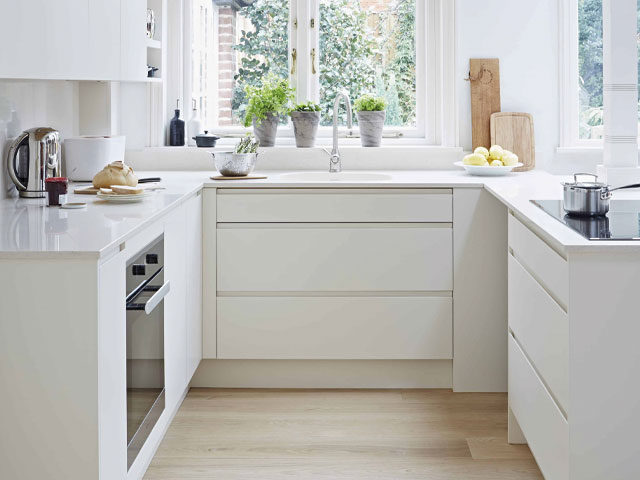
A U-shaped kitchen from John Lewis of Hungerford
4. Islands – for entertaining
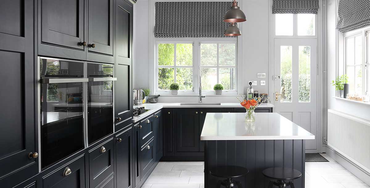
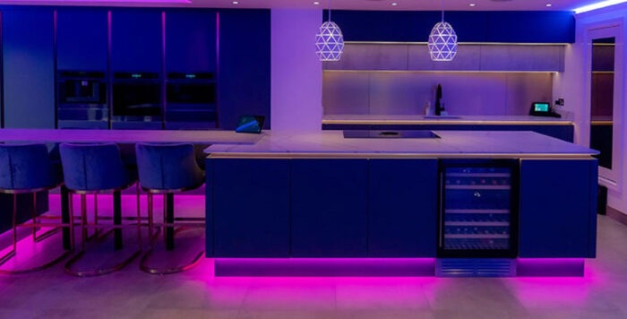
If you have a medium or large kitchen, plan your layout around an island unit, either by itself or complemented by surrounding cabinetry – they’re great for additional storage, versatile workspace and sociable functions.
If you’re using one as a home for appliances, such as your hob, do consider the working triangle and how it affects movement around the room.
Islands aren’t suitable for small kitchens as there needs to be a minimum space around them for doors to open and people to pass easily, plus they can become cluttered and push up your budget.
‘In larger open-plan kitchens, the triangle has evolved into more of a working circle,’ says Steve Tough, commercial sales director at Masterclass Kitchens. ‘In such spaces, the food-prep area is no longer in a corner, but brought centre-stage as part of the island.’
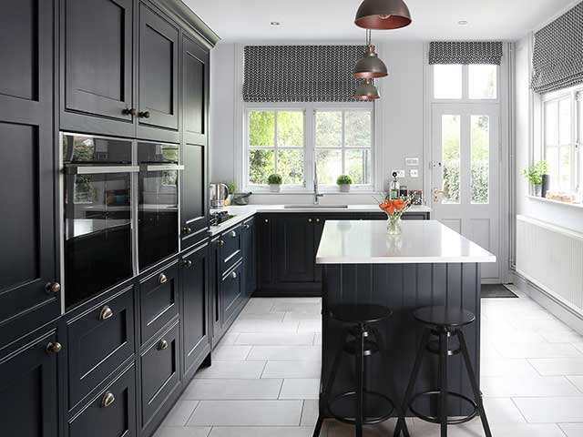
Islands are great for additional storage and workspaces, as well as socialising. Photo: Kitchen Makers
In focus: The working triangle
- A concept used to define the efficiency of a layout, the working triangle draws imaginary lines between three main kitchen areas: the oven, sink and fridge.
- Depending on the layout, this can be more of an even-sided triangle, often seen in a U-shaped kitchen, or a longer shape in a single galley.
- Created in the 60s, the triangle is less strictly followed now but it’s a good starting point for a practical and easy-to-use layout.
- The idea was developed with one cook in mind, so it doesn’t always work with two people working side by side.
- The main consideration is what works for you, while ensuring the route between your preparation and cooking areas, and appliances isn’t obstructed.

