A unique extension with a Disney-inspired roof
This one-of-a-kind project draws on playful themes and innovative materials
When architect Mat Barnes, founder of CAN architects, remodelled and extended his home in South Norwood, London, he took the opportunity to try out some new ideas. The head-turning project incorporates a number of unique features, including an extension framed by a foam aluminium silhouette of a mountain, earning it a Unique Character Prize at the Don’t Move, Improve! Awards 2021, a RIBA London Award 2022, and a spot on the RIBA House of the Year 2022 longlist.
The architect, who takes a ‘multiform’ approach to contemporary architecture, explains the thinking behind the project.
Tell us about the concept
I would describe it as a collection of ideas rather than a single concept. The design incorporates the renovation and extension of our two-storey Edwardian home, taking cues from films, geographical survey equipment, a fake mountain and an Edwardian bread plate, to name a few.
The roof was inspired by images of the Matterhorn Bobsleds ride at Disneyland, California, USA, during its construction – a surreal mountain top on a skeletal frame. The project reflects my ethos that nothing is off the table when it comes to inspiration.
I think, in general, architects have too narrow a field of reference and are often tied to a singular approach, which can result in bland and repetitive projects.
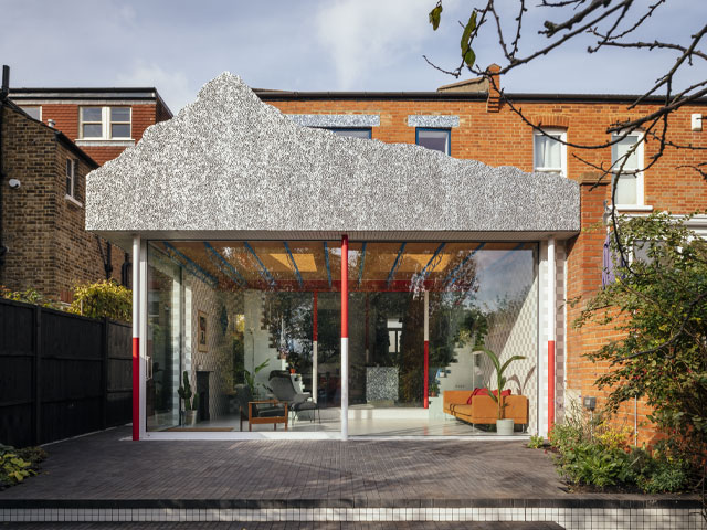
The extension is part of a larger refurbishment costing £220,000. Inside, remnants of the back wall create a partition between the kitchen and living space. Photo: Jim Stephenson
Which elements are your personal favourites?
As an architect, my favourite design details are the mountain roof, and the laser-cut trusses inside. As the owner, I love how the flow of the ground floor works and how connected the kitchen is to the extension.
My wife Laura and I and our kids, Aurie, three, and Sidney, who is nearly two, spend most of our time in the extension as it is always flooded with light whatever the weather.
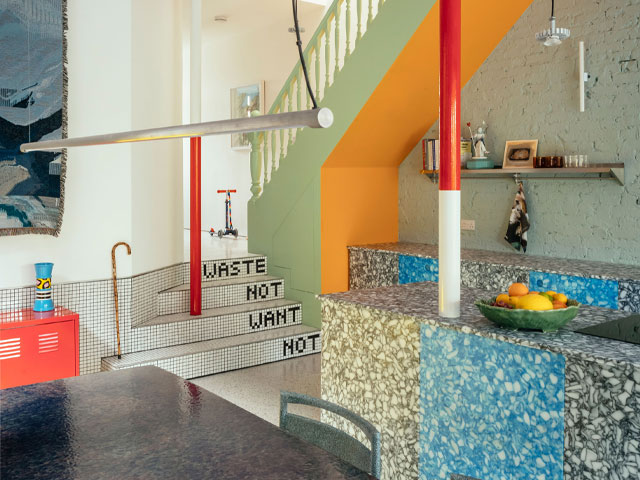
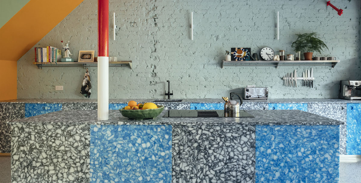
The red and white structural columns recall surveyors’ ranging poles. Photo: Jim Stephenson
How did you choose the colours and materials?
Mostly on site during the build, which is a luxury of being your own client. These decisions are usually made earlier for accurate costs. Material and texture combinations were tested in situ at different times of the day.
We wanted to avoid the default of plastered white walls, and for the architecture and finishes to provide character. The contrasting textures of the kitchen’s exposed brickwork, the dining area’s concrete and the chequerboard tiling, along with the different colours, create a unique home extension that changes throughout the day as the light moves around the house.
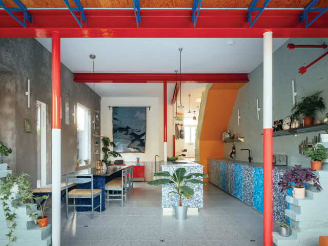
Mat and his wife Laura wanted the architecture and finishes to provide character. Photo: Jim Stephenson
They aren’t exactly ordinary materials…
No, the kitchen is made from recycled chopping boards and milk bottle tops. The mountain is a lightweight foamed aluminium, chosen for its almost space-age appearance and strength-to-weight ratio.
How does the extension relate to the original house?
In plan, it is a simple box connecting the main building to the garden. The site slopes, giving a 1.5m difference between the internal floor and the outside space. We lowered the internal floor by 1m, which provided a much better connection to the garden.
Mountain View dramatically rethinks what a modern home should look like – weaving old and new together in a fun and totally unexpected way.
Check out the metal mountain scape mounted over the roof! ⛰️@RIBA | #HouseOfTheYear | #GrandDesigns pic.twitter.com/4I3GXeiKvA
— granddesigns (@granddesigns) December 1, 2022

